
Avoid recessive orange & other warnings
File under: Is your e-newsletter ready to mail?
9 tiny tests
Back story: Martha joined us for the newsletter webby in January. Tried her hand. Shared her makeover. Asked for comments. Reply below.
From: Tom Ahern
Sent: Thursday, April 2, 2026 10:37:37 PM
To: Martha F.
Subject: Ahern to Martha: A quick look-see @ yr newsletter
Dear Martha,
Thank you for the chance to compare the before and after of your e-news. Always a pleasure to see what people are doing. No charge for any of this; happy to opine away.
[OLD version of Martha's donor newsletter, here:
[NEW version of Martha's donor e-news:
Applied some quick newsletter tests I use with my own stuff:
The YOU test: The best word to keep me reading
The EYE-CONTACT test: Got any?
The 3-SECOND test: Did you make me FEEL something fast?
The SKIM test: What’s good in your photos and bigger type?
The NEED test: Is it clear you depend on support?
The RECRUITMENT test: Did we give the donor a job to do?
The HUGS test: A lot? In big type? Genuine?
The PROBLEM/SOLUTION test: Was their impact from giving?
The SOCIAL-PROOF test: Got any?
The new version passes them all. It's much stronger from a donor relations point of view, in my opinion. You have "you" in the big type immediately (fab!). It passes the 3-second test, the skim test, the need test, eye test, impact test. The recruitment test: also a winner (volunteers are the BEST donors). Plenty of hugs (you can FEEL this new version immediately). Social proof: yup (the testimonial from Rosamaria).
So all good!
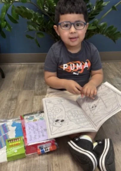
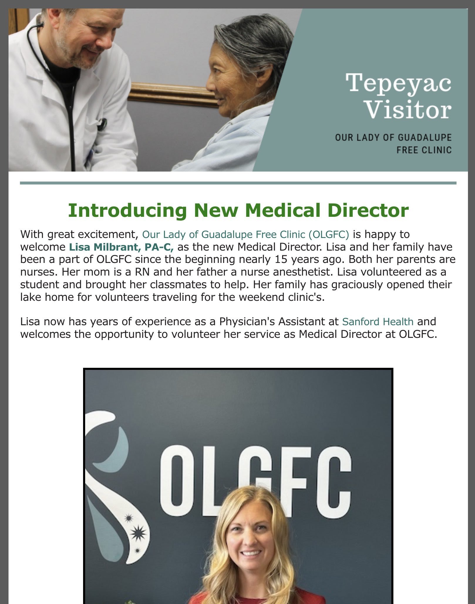
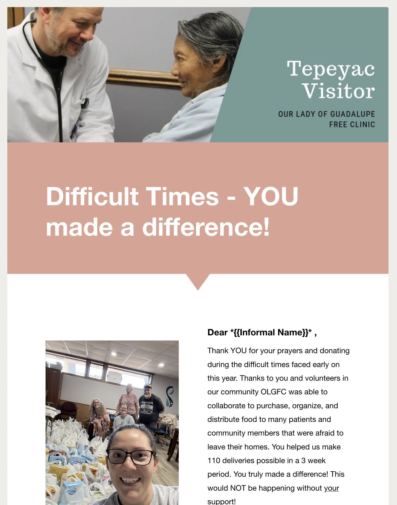
Strengths: Somebody knows how to take a decent (i.e., interesting) photo. Good lighting. Smiling real people (MN nice). Those kids are a shop full of cutie pies. The stories are timely...and when I finally realize that it had something to do with giving ICE the finger, I got enthused. We want donors to be enthused.
Opportunities for deeper penetration: The headlines can [must] work harder (easy fix; tutoring available) + the graphic design is attractive but some typographic choices are undermining the message.
Let's look at one story: "Volunteer opportunities now". That's really half the story. The other half is why it might matter to me, the potential volunteer/reader. You have authentic testimonial (NICE!). Rosamaria says, "Ever since my grandparents started to have their appointments at the Our Lady of Guadalupe [Free] Clinic, I've wanted to give back and volunteer." And it goes on....
but
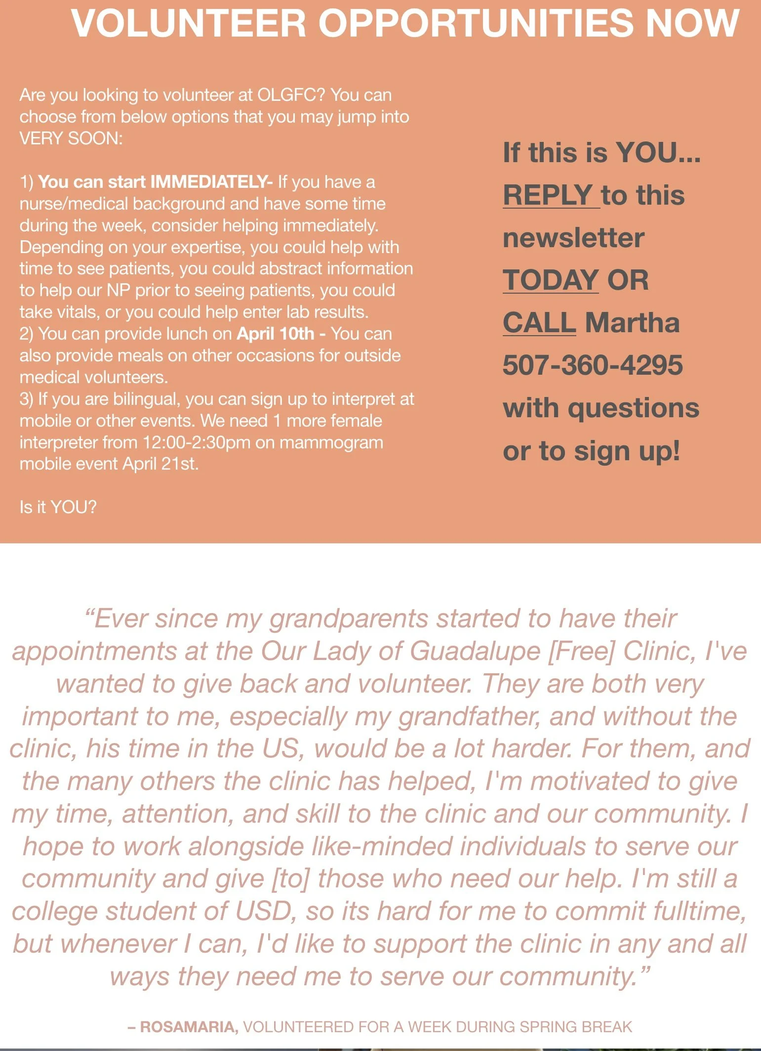
Testimonials need to be short enough to be read at a glance.
And: Choosing a recessive orange color for the type depletes the energy from her words (has to do with contrast & brain).
[Let's pause for an Ahern memory moment: THIS was the exact same first big rookie mistake I ever made in my "professional" (paid for) comms career. Good times!!! That learning curve, huh? What a roller coaster.
Anyway, assignment #1 as the new PR guy for a state agency: create a newsletter (dress code: jacket and tie). I printed our inaugural issue entirely in a single color that looked good to my fashion taste (pretentious): orange ink against a cream background. Somebody's school colors.
A combination of foreground (orange ink) and background (ritzy cream paper) which I later learned has a contrast ratio of below notice.
I chose "pretty" and in so doing made the absolute WORST choice for "legible." I was unschooled, presumptuous, assumptionistHaving handy a basic understanding of how the human optical system worksis essential to communications/advertising success. And, oh, BTW, every fundraising appeal is technically an "ad." Bla, bla, bla...and now back to Martha's stuff]
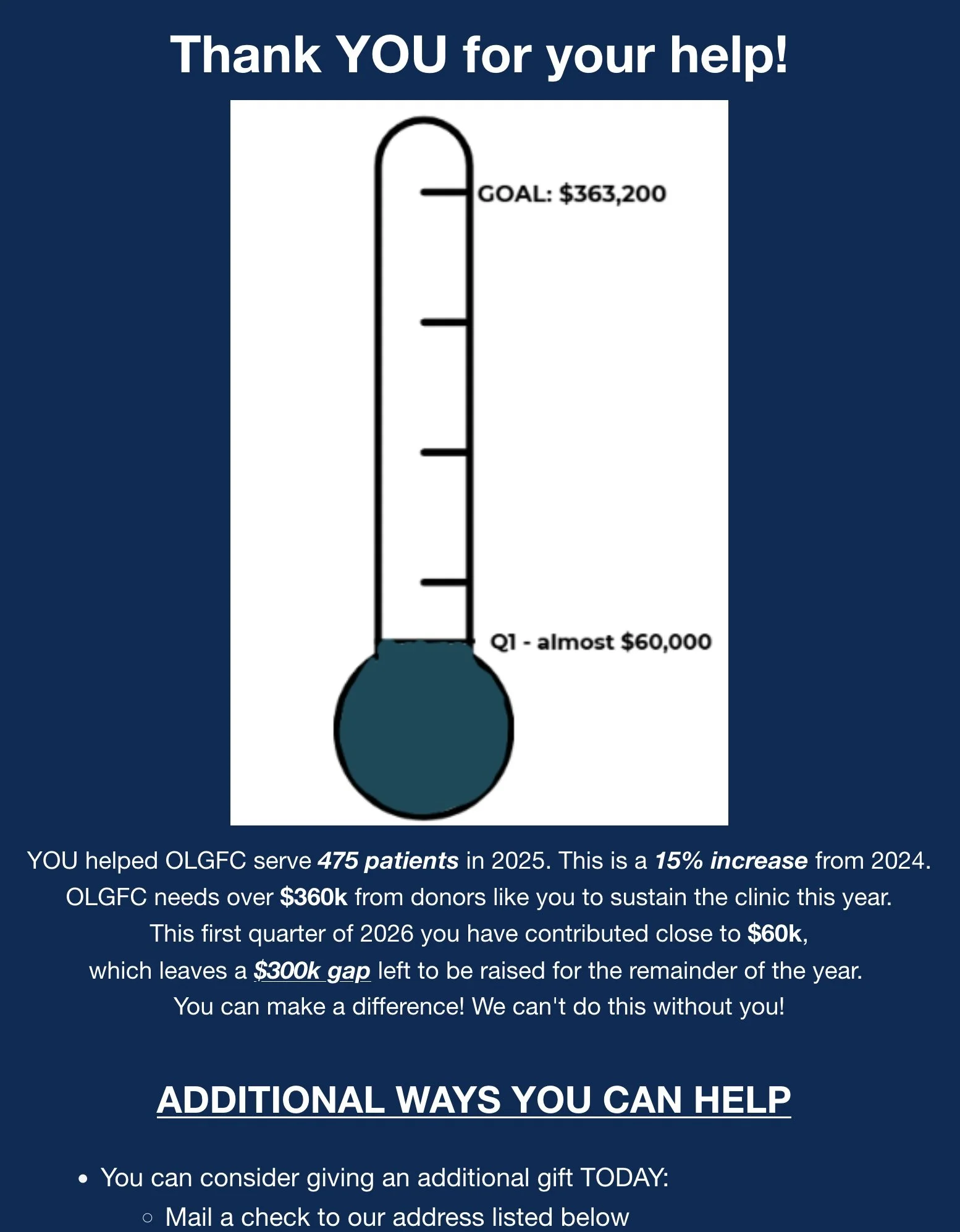
+ Putting your key volunteer opportunity in "reverse type" (white type on a black/colored background) has been shown in lab tests to be relatively unreadable compared to the customary black type against a white background. A few big words in reverse type are fine. But body copy (text) is not; it kills response. The same "reverse type" comment applies to your other big offer: the thermometer appeal.
+ Centering large amounts of text makes it hard to efficiently skim: that, too.
~ tom

Dear Reader: This is an excerpt from Tom Ahern’s e-newsletter. Did you miss crucial back issues of this how-to e-news? Immediately available! Just GO here. (And scroll down just a bit to sign up for Tom’s revenue-boosting tips and insights. In your inbox regularly. It’s free.)