
Does your homepage pass this key & EZ test?
File under: A welcoming home page
A visitor arrives…
Is your homepage ready for common impatience?
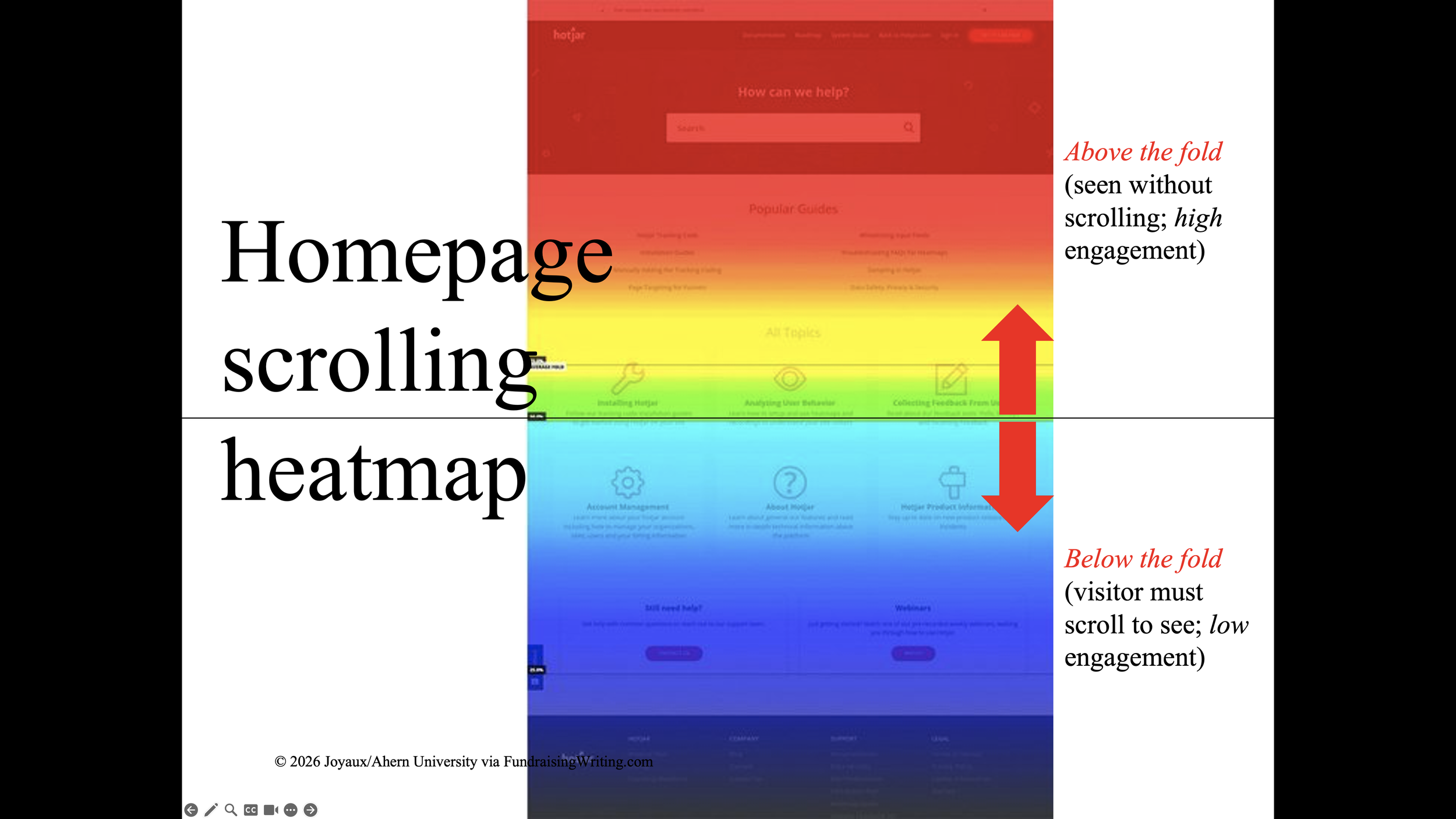
“Above the fold” matters most. “Below the fold” is a death sentence. Let’s just stick with that for the moment…
The facts uniformly suck…
The High Bounce Rate: The average bounce rate for US nonprofit websites sits between 60% and 70%. This means that nearly two-thirds of all new visitors spend fewer than 10 to 15 seconds on the homepage before leaving without clicking a single link. [Nonprofit Tech for Good, 2026]
The Homepage Dilemma: The homepage is the primary entry point for 38% of all nonprofit traffic. Because it bears the burden of introducing the organization to new visitors, it requires immediate clarity. [Wired Impact, 2025]
The 50-Millisecond Judgement: New visitors form an aesthetic impression of a charity's website within 50 milliseconds. [That's far short of a blink.] A clunky or outdated layout immediately erodes trust, causing immediate drop-offs. [AFP, 2024]
There's more. Martinis or tissues, anyone? The "heat map" below shows the sad state of affairs: people don't scroll much. Anything you are desperate for me to act on—like the subscription sign-up for your e-news—really has to be ABOVE the fold (see chart below, from 2027 show prep). BELOW the fold is a tomb; almost no one visits.
So, anyway, my phone rings...
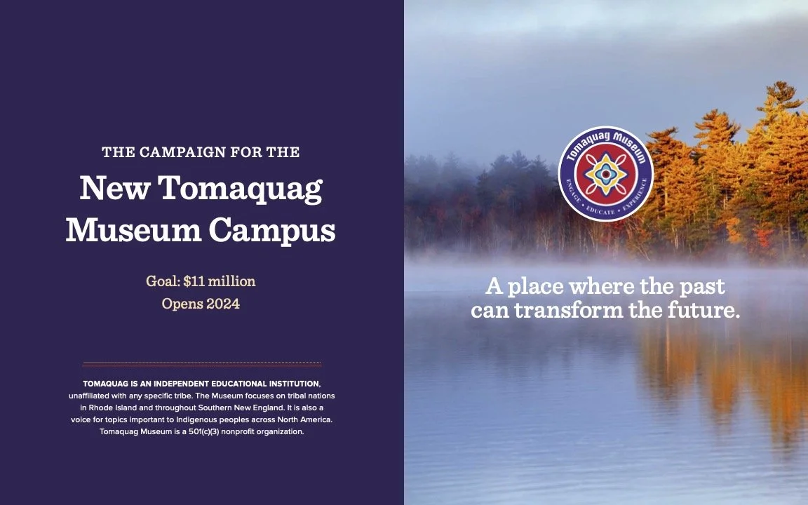
The landline: Lorén, the ED at the Tomaquag Museum, calling. She's on speaker. We talk a few times a year. I wrote an early case for her, volunteering when the museum launched its $12-million capital campaign for a new home. We're friends. The campaign is two-thirds of the way to goal, almost ready to break ground. She's a visionary leader, in demand as a board member. In 2016, Michelle Obama presented little Tomaquag (founded in 1958 by a white anthropologist and native Princess Red Wing) with the nation's highest award for museum achievement; so, you know, good people doing good work for more than a half-century.
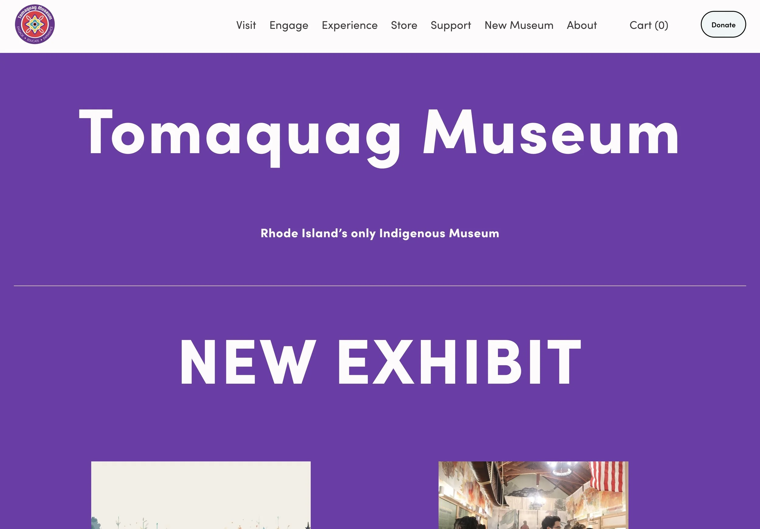
Our conversation touches marketing. We visit the museum's website together and spot a big problem immediately. The homepage above the fold lacks a feature critically important if you hope to build a family of eager supporters
"How do I sign up for your e-newsletter? Which I love by the way. I read every bit of it. Somebody's doing a fabulous job."
"I found it," said Lorén. "Just scroll. The subscribe box is at the bottom of the page. You'll see it if you scroll."
Alas. The subscription offer is the top of a vitally important sales-lead funnel, aka lead-generation funnel.
Here's the museum's current homepage, above the fold:
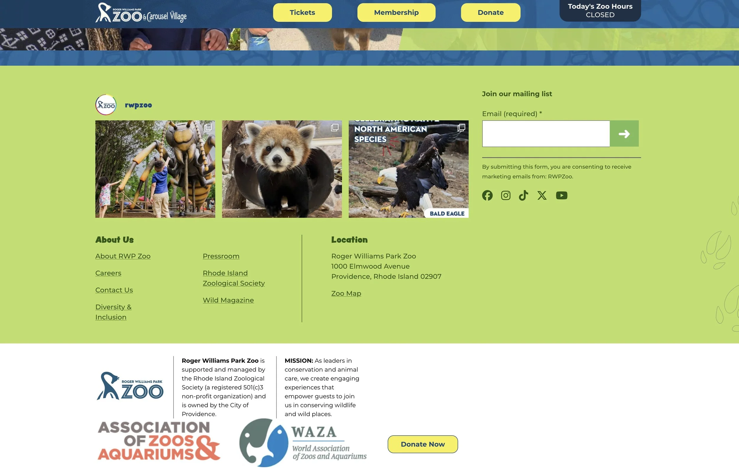
For comparison, we visit the homepage of a nearby city zoo, to see how they handle their above-the-fold real estate. This is a high-volume website and the revenue stakes are high. The zoo attracts 800,000+ visitors annually. The zoo has focused on its target audience since the 1990s, when visionary leadership set a new course. The zoo vies with Newport's celebrated mansions as Rhode Island's #1-visited paid attraction and has for 30 years.
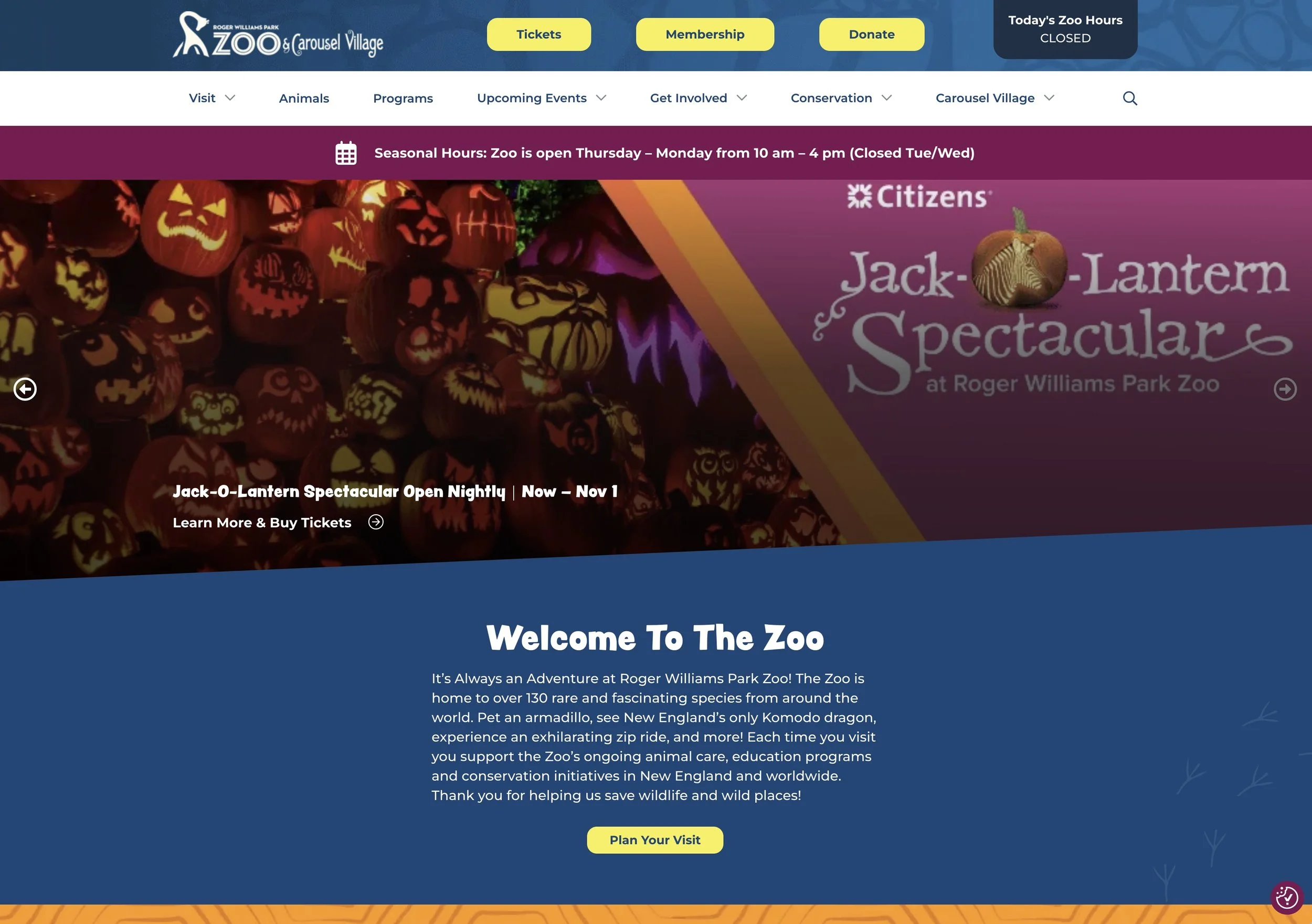
Lorén immediately likes how the zoo's homepage highlights three key actions at the tippy-top, in bright yellow buttons. Two are high-value customer interests. The third is an appeal for charity.
Overall, the zoo's website delivers a good "user experience" (UX), which is ridiculously important if you're an attraction selling programming. The site's easy to navigate. Answers all the FAQs. Makes ticket purchase easy. Is fun. It's a solid 10 out of 11. The one way it fails? The same way Tomaquag's homepage fails, by putting the subscriber box at the bottom, where it's out of sight, out of mind, shockingly unvisited, exiled deep on the heatmap, in the cold and dark.

Dear Reader: This is an excerpt from Tom Ahern’s e-newsletter. Did you miss crucial back issues of this how-to e-news? Immediately available! Just GO here. (And scroll down just a bit to sign up for Tom’s revenue-boosting tips and insights. In your inbox regularly. It’s free.)