EOY appeals: adding "skimmable" to 1st draft
File under: Visual makeover of year-end appeal
How to keep more readers reading
Skimmability
[from confidential email to me] I'm wondering if you could look at [well-known ED]'s first draft [of the year-end {EOY}appeal] (note - I think [confidential email continued] it was a combined effort of [name of 2nd in command, who's also this ambitious advocacy/museum's lead scholar/presenter], [name of .org's creative and comms director], and [ED] ... kudos for them scrambling to get SOMETHING out there [there had been a sudden glitch, EOY ltr. not finished, U.S. Thanksgiving nears].
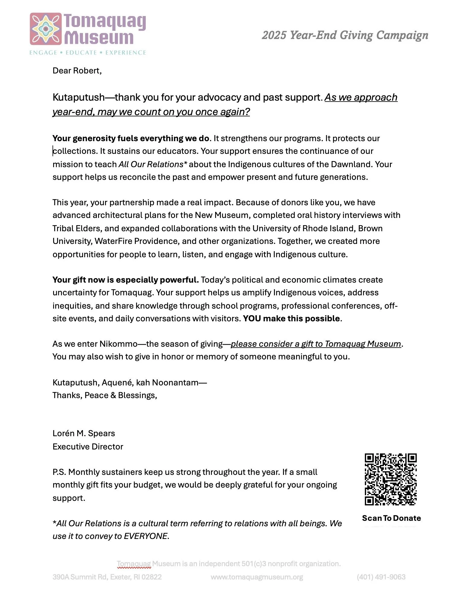
Original draft below, by committee of 3 top staff incl. ED (signatory); PRO: super-duper donor-hugging; CON: crammed onto 1 page (for economy?) with uncaptioned pictures that have no eye contact with reader...
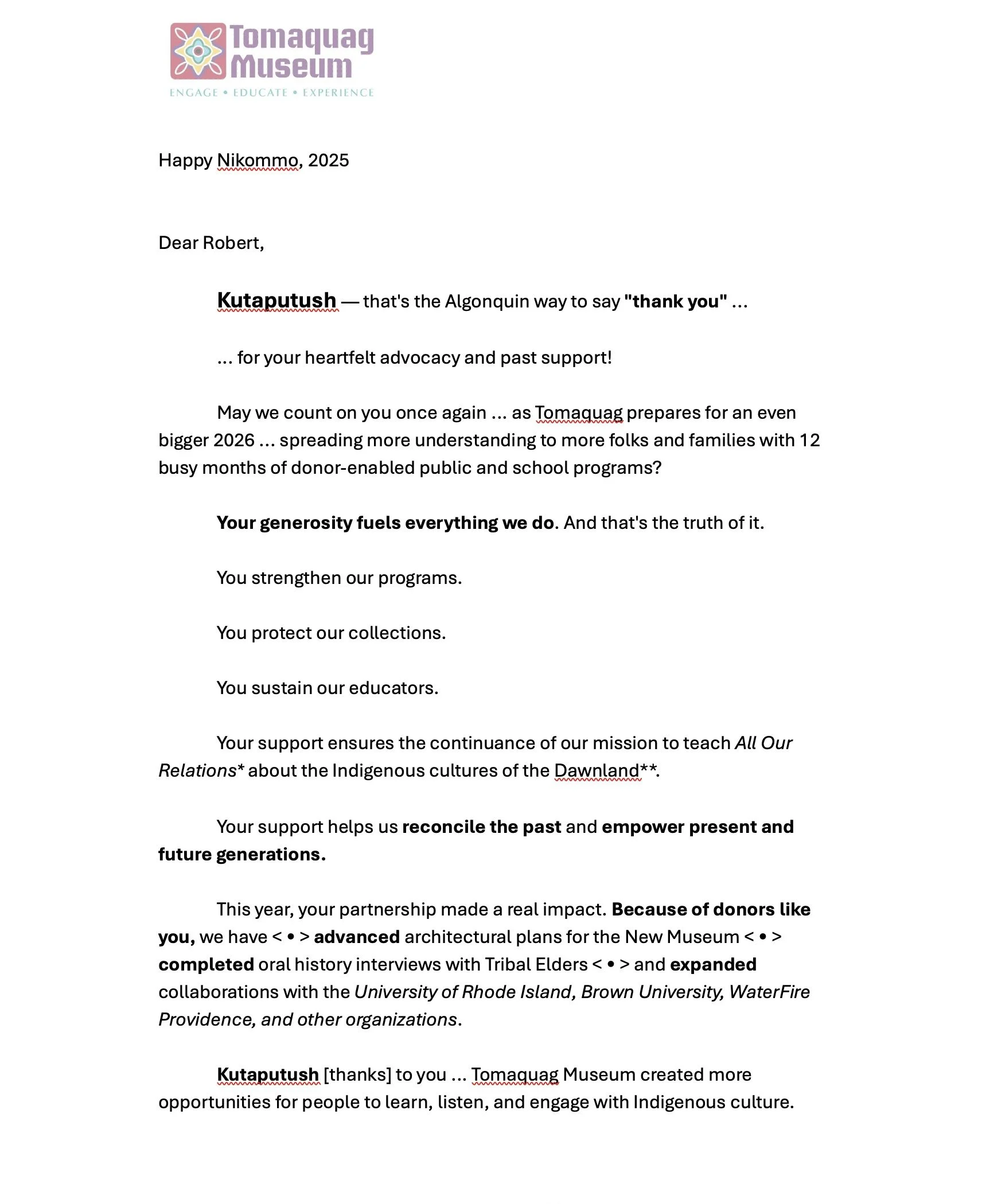
Next draft below, a slight rewrite by their fundraising consultant (committee member #4), retaining much of the staff's text; looking for a better photo to grab the reader; lowering grade level. PROs: Faster, keeps charming donor-hugs. CON: Still 1 page and visually a "no go" zone for skimmers.
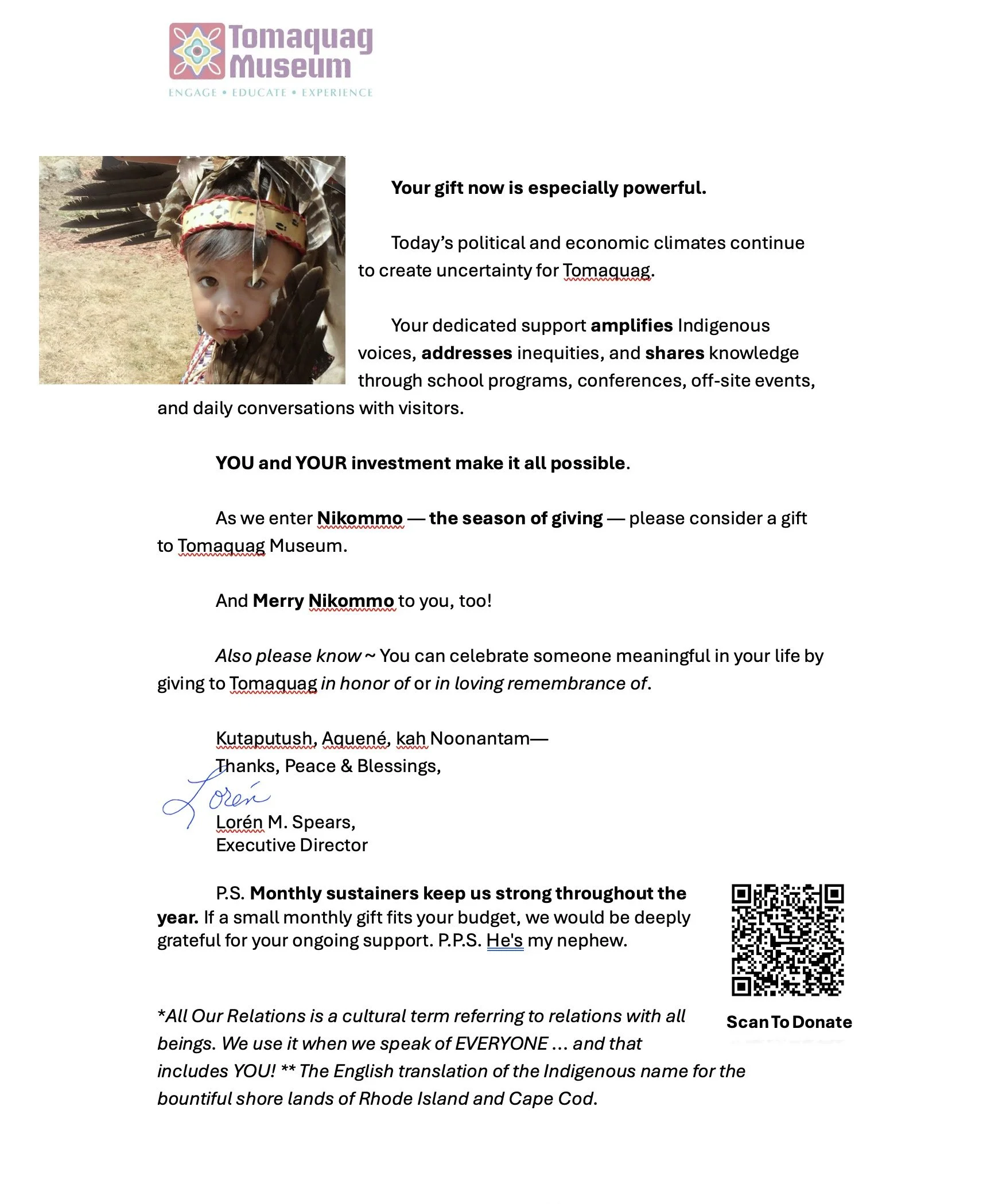
Final draft IMHO, a quick makeover (committee member #5) focusing on "ease of reading" (skimmability; indents, short paragraphs, cool use of bolding to hijack the eye/mind/heart); PRO: now 2 pages, both sides of 1 sheet of paper. Read the PPS.
The article above contains ZERO AI contributions. A human wrote every word.
Dear Reader: This is an excerpt from Tom Ahern’s e-newsletter. Did you miss crucial back issues of this how-to e-news? Immediately available! Just GO here. (And scroll down just a bit to sign up for Tom’s revenue-boosting tips and insights. In your inbox regularly. It’s free.)


